
Key takeaways
- On September 8 a calculator page we built showed its results letter with pale grey text on white. Most of the labels and numbers in its tables were hard to read. A few cells looked fine.
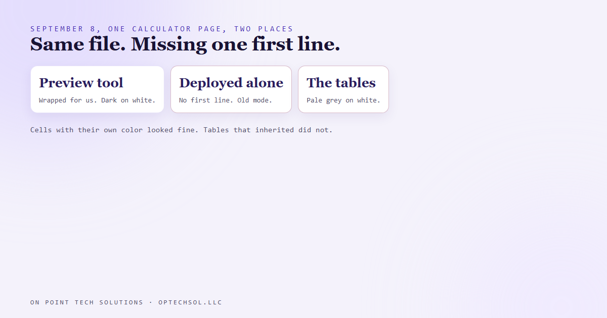
- The page had been written for a preview tool that wraps it in a proper web document. Deployed on its own, it was missing the first line that tells a browser what kind of document it is.
- Without that line, the browser falls back to an old compatibility mode. In that mode, tables don't take their text color from the box around them. They take the page's.
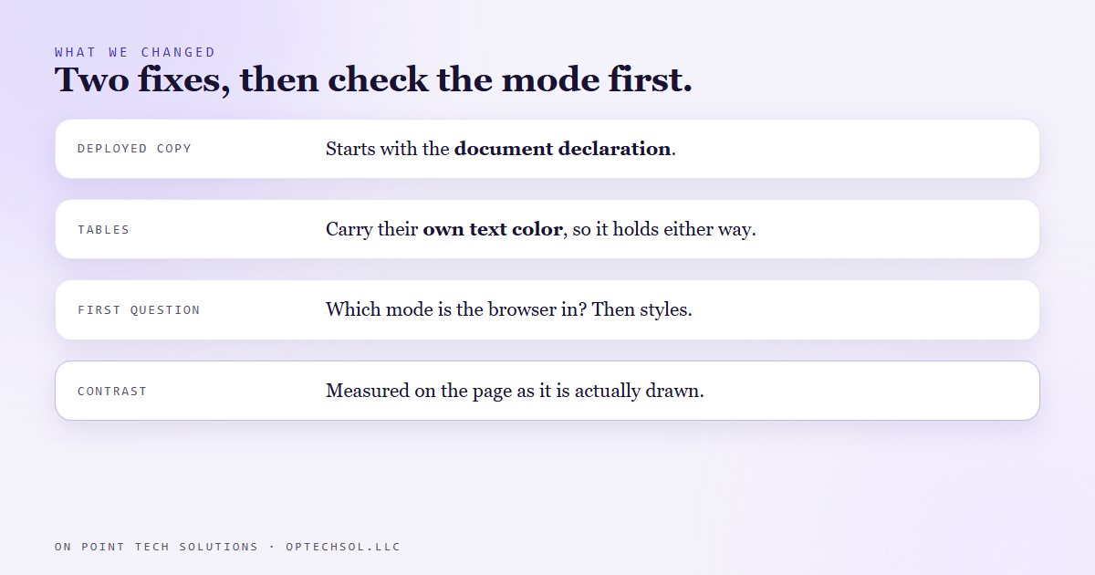
- The fix was the one line on the deployed copy, plus setting the color on the tables directly so it holds either way.
- "It looked fine when I checked" depends on where you checked. Contrast gets tested on the page a customer actually sees.
A lot of the Go High Level San Jose work we do ends with a page. A funnel step, a booking page, a quote form, a results screen. And every one of those pages gets looked at in two very different places: wherever we built it, and wherever a customer opens it.
Usually those two look the same. On September 8, one of ours didn't.
The letter nobody could read
We built a calculator page. You put in some numbers, and it writes you a short results letter with a couple of tables in it. The page itself has a dark theme with light text. The letter sits on top of it as a white sheet, like a printout, with dark text.
When I opened the live page, the letter was hard to see. Every label and value inside its tables had come out in a pale grey, almost the same shade as the white behind it. A few cells looked perfect. The rest you had to squint at.
The weird part was that it had looked fine while we were building it. Same file, same styling. Different place.
One missing first line
We drafted that page inside a preview tool that takes a bit of page code and wraps it in a full, proper web document before showing it. Because the tool adds the wrapping, the file itself never had the very first line a normal web page starts with: a short declaration that says "this is a modern web page, read it with modern rules."
Inside the preview tool, that didn't matter. The tool supplied it. When we put the same file on the web by itself, nothing supplied it.
A browser that opens a page without that line assumes it might be very old, and switches into a compatibility mode built to keep ancient websites from breaking. Most things look the same in that mode. Tables don't. In modern mode a table picks up its text color from whatever box it's sitting in. In compatibility mode it ignores the box and takes the color set for the whole page.
The whole page was dark with light text. The letter set its own dark text on its own wrapper, and counted on everything inside to follow. The tables didn't follow. They reached past the white letter, grabbed the page's light grey, and printed it on white. The cells that looked fine were the ones with a color set on them directly, so they never needed to inherit anything.
What we changed
Two things, on purpose, because either one alone leaves a gap.
First, the deployed copy now starts with the proper first line, along with the two short lines that set the character set and how the page sizes itself on a phone. The draft stays as it was.
Second, the letter's tables and table cells now carry their own text color, set directly on them. So even if the page ever ends up in compatibility mode again, by some other route, the text inside the tables stays dark on white.
And the order we check things in changed. When a page looks right in one place and wrong in another, the first question now is which mode the browser is reading it in. Only after that do we start touching colors, because tweaking styles on a page in the wrong mode just moves the problem around.
Why we test contrast on the real page
Every website we build has to meet the WCAG 2.2 AA accessibility standard. Part of that is contrast: ordinary text has to stand out from its background by at least 4.5 to 1. It's easy to check that on paper. Take the text color, take the background color, run the math, done.
This page would have passed that check, because the colors we wrote were fine. The problem was the colors the browser actually drew.
So later in September we built a checker that measures the page as it's actually drawn. It loads the real page in a real browser, takes a picture of it, reads the text color the browser ended up using, and samples the actual pixels sitting behind each piece of text.
What this means for Go High Level San Jose businesses
You've probably been on the receiving end of this. Your email looked great in the editor and arrived in a customer's inbox with the buttons stacked wrong. Your website looked sharp on the office computer, and a customer's phone in dark mode turned half of it unreadable. The PDF quote looked clean on your screen and printed with a column cut off.
In every case the file was fine. The place it got opened was different, and that place was quietly filling in something your version had been getting for free.
Three things worth doing this week:
- Open your website and your booking page on your own phone with dark mode turned on. Read every form label and every price out loud. If you have to squint, so does your customer.
- Send your main email template to yourself at two different email services, and open it on your phone too. Compare all three to what the editor showed you.
- Ask whoever builds your pages how they check contrast. If the answer is "the colors are on brand," ask whether anyone has checked the page as it actually shows up.
When a Go High Level San Jose builder tells you a page looks good, ask where they looked at it. One answer isn't enough.
Want to build this yourself?
Join the On Point Tech Academy at optechsol.llc/academy. It's free, and we build live every Tuesday and Thursday.
The On Point Tech Academy costs nothing and never asks for a card. We build live every Tuesday and Thursday, 12:30 to 1:30 PT.
Join the Academy free ← Back to all Field Notes